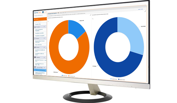
We are excited to announce we’ve added six new Operational dashboards to Curve Business Intelligence. These dashboards give actionable insights into Recare, Referrals and Treatment Plans as part of our growing library of Playbook dashboards.
At Curve, we know how important Recare and Referrals are to maintaining and growing a healthy practice. We also know that once you get patients in the door, the next most important thing is acceptance of the Treatment Plan. We have received requests from many of our customers to prioritize the release of these dashboards and are very excited they are now available with all Curve Hero subscriptions.
By combining the insights of these three new dashboard categories you will be able to answer questions like:
- How much revenue opportunity do I have with my existing patients in unscheduled Recare?
- Is my front office team doing a good job scheduling Recare appointments?
- Are my marketing efforts really working to bring in new, profitable patients?
- How much potential production is sitting in unscheduled treatment plans?
Keep reading to see how Curve Business Intelligence can help you answer those questions and more with just a click of a mouse.
Recare dashboards
As we all know, setting appointments with existing patients is easier and more cost effective than constantly having to add new patients to fill your schedule. With that in mind, our new Recare Overview dashboard makes it easy to compare scheduled and unscheduled Recare appointments at your practice. And then you can easily focus your team on those patients with unscheduled - it's like found money!
You can also see Recare trends over the previous six months and forecast for the next six months to know instantly if you’re making improvements or are slipping behind.
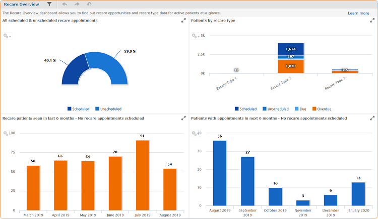 Recare Overview dashboard |
Referral dashboards
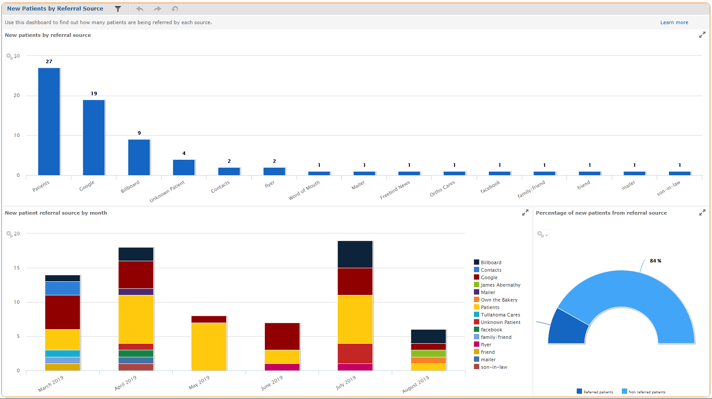
In order to grow your practice, you rely on referrals from happy customers telling their friends and family and marketing efforts such as billboards, mailers and social media ($$$). To give you real data (not just gut feel) into where your new patients are coming from, we have two new referral dashboards: The New Patients by Referral Source dashboard to provide insight into how your practice is generating new patients, and the Production by Referral Source dashboard provides a graphical view of many key production factors, like the dollar amount associated with each referral source to calculate your return on investment.
 |
Treatment plan dashboards
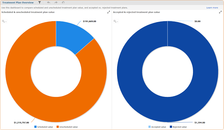
Knowing the breakout of scheduled versus unscheduled treatment plans for your practice is crucial. The Treatment Plan Overview dashboard was designed to identify the potential opportunity with real time insight into the monetary value associated with unscheduled treatment plans. See exactly how much money you are leaving on the table with your existing patients at any time.
|
Treatment Plan Overview dashboard |
At Curve, we believe it is our responsibility to provide dental practices with the tools they need to effectively and efficiently run their practices in the cloud. The addition of these new dashboards to Curve Business Intelligence allows practices to unlock their data and provide it to them in a straightforward way, allowing them to run a more profitable and healthy practice. Our philosophy at Curve is — you should expect more from your practice management system — and at Curve we are determined to deliver more.
Additional dashboard training is also available to our customers through our free, monthly Curve Hero Huddle training webinars!

